Logo & Brand Identity Project
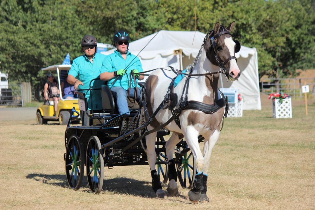
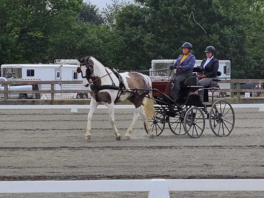
Cartwheel Farm is a beautiful facility in Oregon City that specializes in combined driving. The sport, conceptualized by the late Prince Phillip, Duke of Edinburgh, is modeled after the mounted equestrian discipline of three-day eventing or the human equivalent of a triathlon. The Farm is owned by Krista Tanner, who holds lessons and clinics for driving events and is an enthusiastic champion of the sport and adding more competitions in the area.
This project centered on brand identity and logo development that captures the elegance, movement, and heritage of the sport while honoring the welcoming spirit of the farm.
Krista needed a custom-illustrated logo that speaks to the sophistication and history of driving:
- Reflects movement, trust, and connection between driver and horse
- Is adaptable for signage, apparel, event materials, and sponsorship presence
- Helps introduce the sport to new participants in the region
Creating a strong, recognizable brand identity was essential for:
- Increasing visibility of combined driving in the Pacific Northwest
- Supporting future clinics, local competitions, and community outreach
- Helping Cartwheel Farm stand confidently among other equestrian training disciplines
The Challenge & Goals
Before this project, Cartwheel Farm did not have an established visual identity that represented its specialized focus on combined driving. Most existing imagery for driving sport centers is either outdated, overly ornate, or doesn’t translate well into modern branding.
My Role & Scope
I led the branding project from start to finish, including:
- Discovery & brand positioning conversations
- Visual research into classical driving forms & silhouettes
- Custom illustration of the horse and carriage
- Typography and composition refinement
- Preparing final brand assets for web, signage, embroidery, and print
Process Highlights
Discovery & Strategy
We began by exploring the essence of combined driving: precision, communication, grace, and the tradition of carriage work. I learned about the farm community, Krista’s values, and her long-term vision for growing the sport locally.
Brand Direction
We focused on a silhouette, timeless visual style that evokes elegance without feeling overly formal. The horse and cart are designed to feel elegant and forward-moving.
Results
The farm operated on a strong reputation and personal connection, but lacked a visual presence that matched the pride, skill, and tradition of the sport. Combined driving is an art, yet nothing visually communicated its grace or personality. The new brand mark brings that story forward. The illustration captures the dynamic relationship between driver and horse, honoring the heritage of the sport while remaining modern and versatile. Cartwheel Farm now has a logo that feels like the place: welcoming, capable, refined, and rooted in tradition.
Impact & Takeaways:
- A memorable and recognizable brand mark
- A visual anchor for future shows, clinics, and sponsorship opportunities
- A way to elevate the public perception of combined driving in Oregon
- A professional presence that supports growth of the sport locally and regionally
What I Loved About This Project
Honestly, what brought me the most joy about this project is exploring a discipline I had almost no knowledge of. I definitely got lost in YouTube watching competitions and highlights. I loved learning more about the community Krista is building and the role this farm is playing in growing the discipline.
If you’re building or growing your own equestrian business and want a visual identity that truly reflects your story, I’d love to create something meaningful with you.
Let’s talk about your project.