

Logo & Brand Identity Project
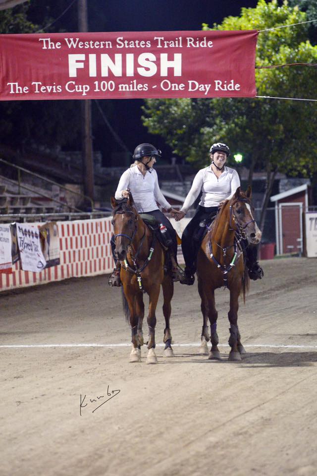
High Tail Ranch is a small equestrian farm owned by endurance rider Jennifer Stalley, located just north of Santa Cruz, California. Jennifer grew up within the long-distance riding community and competes and volunteers at endurance rides, including the renowned Tevis Cup. This project focused on developing her first professional brand identity inspired by her favorite moments growing up, watching her parents’ horses fly away from a clean checkpoint.
Main Outcomes:
- A custom-illustrated logo inspired by movement, freedom, and the Arabian horse
- A brand identity direction that honors her family’s endurance riding legacy
Services Provided:
- Brand discovery & story development
- Logo design
- Brand guide development
The Challenge & Goals
Before:
High Tail Ranch did not have a brand identity or visual representation, just a name and a deep personal history.
What Was Needed:
Jennifer wanted a logo that felt meaningful, rooted in her family story, and connected to her experience of seeing horses move on from checkpoints during endurance races, tails raised, energy high, ready for miles ahead.
Why It Mattered:
The brand identity would become the foundation for her farm’s presence at endurance events, on tack and gear, future signage, ranch materials, and community involvement. A thoughtful visual identity helps her show up confidently and recognizably within a close-knit riding community.
My Role & Scope
I led the project end-to-end, from early story exploration to final logo delivery.
Tools & Approach:
- Brand story interviews and visual direction sketches
- Hand-drawn concepting followed by digital refinement
- Vector illustration using Adobe Illustrator
Process Highlights
Discovery & Story
We explored Jennifer’s riding history, her connection to her parents’ horses, and her experiences on the endurance circuit. This is where Jennifer really opened up about her favorite moments, especially the memory of horses leaving checkpoints.
Brand Direction
We identified core themes: movement, power, and freedom. The brand needed to feel elegant but expressive and strong.
Results
Before, High Tail Ranch lacked any visual identity and presence. Now, the farm has a distinct, meaningful brand mark that reflects its story and gives Jennifer a strong visual footprint for future signage, digital presence, and embroidered gear.
Impact & Takeaways:
- The final logo is unique and personal, not generic horse clip art
- It resonates emotionally with Jennifer and her family
- It creates a strong brand position within a respected riding community
What I Loved About This Project
This project was a joy because it centered around story, memory, and deep personal meaning. I loved translating such a vivid emotional image — the moment horses take off from a checkpoint — into a mark that now serves as the visual heart of her farm.
If you’re building or growing your own equestrian business and want a visual identity that truly reflects your story — I’d love to create something meaningful with you.
Let’s talk about your project.